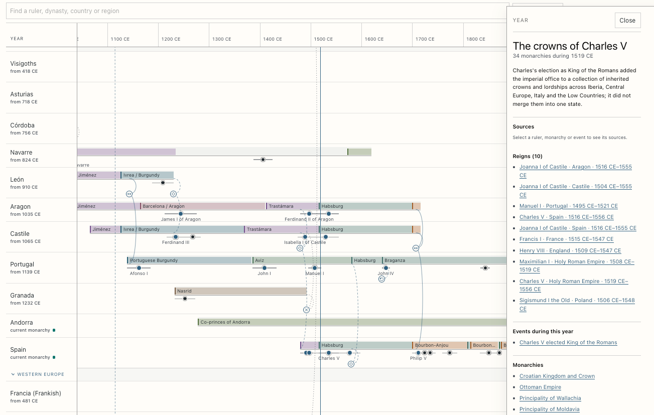
I wanted to see which European monarchies existed at the same time, so I built The Braided Crowns of Europe, a timeline that puts two thousand years of crowns on one shared axis, from Augustus in 27 BCE to the twelve sovereign monarchies at the 2026 snapshot. It has 78 monarchy lanes, 266 selected reigns and 73 typed connections between lanes: conquests, shared rulers, unions, partitions and endings. Move the year line to 1519 and Charles V appears in two lanes, Spain and the Holy Roman Empire. Move it to 1918 and the German and Austro-Hungarian monarchies are in their last year, while the Russian monarchy, which fell in 1917, is already gone. Go play with it, and read on if you want to know why it looks the way it does.
Why I made this
I’ve always been fascinated by the history of the crowns. The problem is that most of it arrives one country at a time. You learn the Tudors, then perhaps the Bourbons, the Habsburgs or the Romanovs, and each line makes sense on its own. Henry VIII and Francis I were near-contemporaries. Charles ruled the Spanish crowns jointly with his mother Joanna before adding the imperial office to his other titles. James VI of Scotland became James I of England without Scotland and England becoming the same country. These facts are easy to recite and surprisingly hard to hold in your head at the same time. This is why I liked so much Horizontal History by Randall Munroe. Famous people laid out on a shared timeline.
The other push came from Cartographies of Time, Daniel Rosenberg and Anthony Grafton’s history of the timeline, which I first came across in this post on The Marginalian. It’s full of fantastic timelines: centuries of people trying to draw history as a picture you can take in at a glance. The one I couldn’t stop looking at was John B. Sparks’s 1931 Histomap, “Four Thousand Years of World History”, where empires flow down the page as colored streams that swell, thin out and swallow each other. I wanted something like that for the crowns of Europe.
I went looking for a chart that did this and found good pieces, but never the whole thing. There’s the timelapse map of every ruler of Europe from 400 BC to 2017 that Open Culture shared, which is hypnotic but moves too fast to compare anything. There’s the Timeline of European Monarchies over at r/UsefulCharts, a Timetoast timeline of European monarchs, and the Met’s Heilbrunn Timeline of Art History, which I still have open as I write this.
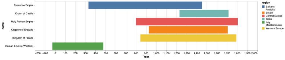
The first prototype was six colored bars: Rome, Byzantium, England, France, the Holy Roman Empire and Castile. It showed that a shared time axis was useful, and not much else. Every bar looked independent. I had no way to show that one person held several crowns, that two kingdoms shared a monarch, or that one political phase ended by becoming part of another.
Why it isn’t a Sankey diagram
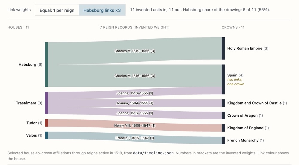
The obvious next step was a Sankey diagram. Monarchies could become streams that split, curve and merge, the way empires do in the Histomap.
But a Sankey needs a quantity. A thick line means more energy, money, material or people passed through it. What would the thickness of France mean here? Territory? Population? Revenue? Military power? Those numbers exist for some periods and turn into guesswork for others. If the width carried no value, the chart would borrow the authority of a quantitative form without doing the accounting. Making the Habsburg line twice as thick as the Tudor line would look informative without saying what I had measured.
So every monarchy in the desktop timeline has the same height. Width is time and nothing else. The chart can tell you that the Byzantine Empire lasted longer than the Kingdom of Italy. It says nothing about which one was more powerful.
Why it isn’t a dendrogram
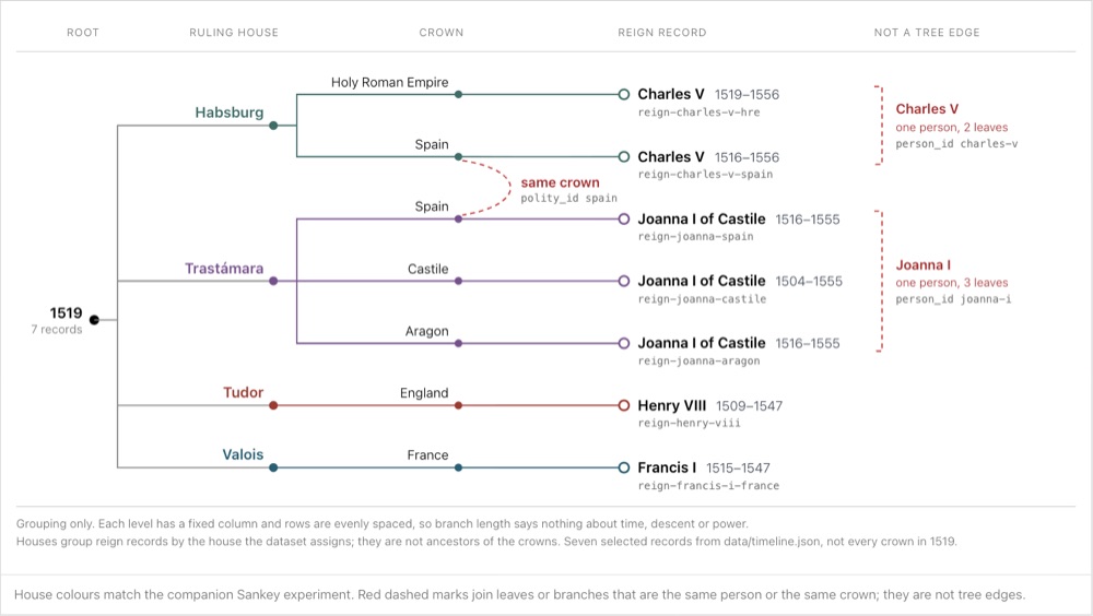
The second idea was a dendrogram (I always write “dendogram”, it’s dendrogram, with the r). Monarchies are dynastic, so put the houses in a tree and let the branches explain the crowns.
It’s hard to find a good one for royal history, and after trying to build it I understand why. A dendrogram assumes a hierarchy. That works until the first marriage, election, restoration or disputed succession. A person has two parents. A royal house has cadet branches. An elective crown can move between families. One monarch can hold several titles, and a personal union can end without either state ending. What you get is a network, and a tree it’s not a network.
A braided timeline
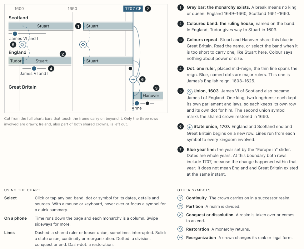
So I settled for a timeline with one shared year axis. Political phases are long neutral bars. Ruling houses are narrower colored bands inside them, with the house name written on the band when there is room (that’s where color by family ended up).
Five years to open in the timeline
843. The Treaty of Verdun divided the Carolingian Empire among the sons of Louis the Pious. It didn’t create France and Germany in their modern form, but it did produce western, middle and eastern political lines that later rulers kept reusing. On the chart, Francia’s partition connects to West Francia in the French lane, Middle Francia and East Francia. A separate connection at 962 follows Otto I’s imperial coronation, so the chart doesn’t suggest the empire already existed at Verdun. Open the timeline at 843.
1066. William’s conquest of England is why house and polity need separate records. The Kingdom of England lane continues while the ruling house changes twice in one year: a short Godwin band for Harold II’s nine-month reign, then the Norman band. Open the timeline at 1066.
1519. This is the date I keep coming back to. Charles began ruling the Spanish crowns jointly with his mother Joanna in 1516 and was elected King of the Romans in 1519; his papal coronation as emperor came in 1530. He didn’t fuse the Spanish kingdoms and the Holy Roman Empire into one state. He was one person with several titles and jurisdictions. So the data has one Charles V with separate reign records, and at 1519 his name appears in two lanes, Spain and the Holy Roman Empire. Joanna’s reigns in Castile, Aragon and Spain are recorded too. Open the timeline at 1519.
1707. James VI of Scotland inherited the English crown in 1603. The two kingdoms shared rulers and kept separate parliaments, with an interruption during the republican period, and the same sovereign also held the Irish crown. In 1707 the Acts of Union created Great Britain. Those are two different relationships, so they get two different marks: dashed personal-union connectors before and after the Interregnum, then a state-union connector that ends the English and Scottish lanes and starts the Great Britain lane. Open the timeline at 1707.
1918. The German and Austro-Hungarian monarchies both ended in 1918, at the end of the First World War. The Russian monarchy had fallen in 1917, so its lane has already ended at 1918, and the Ottoman sultanate was abolished in 1922. On a shared scale you can compare those endings. Open the timeline at 1918.
Lanes follow historical polities, not modern countries
Using today’s countries as permanent rows would collapse distinct historical polities. “Germany” before 1871 would swallow the Holy Roman Empire, Prussia, Austria, Bohemia and dozens of states that probably didn’t think of themselves as pieces of a future nation. “Italy” would do the same to Savoy, Sardinia, Sicily, the Papal States and the northern republics.
So the timeline uses historical polities, and a lane is an editorial container. Most lanes are one polity, but some join closely related constitutional phases to keep the overview readable. France, for example, holds West Francia and the pre-revolutionary kingdom, the two Napoleonic empires, the Bourbon Restorations and the July Monarchy, and the gaps between those bars show where the monarchy was interrupted.
England, Ireland, Great Britain and the United Kingdom get separate lanes because the Acts of Union created new states. Castile and Aragon stay visible through the composite-monarchy period. Spain also has its own overlapping dynastic phase from 1479, on purpose: Isabella and Ferdinand shared a monarchy without erasing the two crowns.
Sicily, Naples and the Two Sicilies are separate lanes, since the island stayed under Bourbon rule while Napoleon’s appointees ruled Naples. Poland distinguishes royal, ducal and fragmented periods.
Kyivan Rus’ is treated as shared medieval eastern European history, not the exclusive predecessor of one modern state. Galicia-Volhynia records one western Rus’ line into lands later divided between Poland and Lithuania. Muscovy gets its own lane because its direct transition into the Tsardom of Russia in 1547 shouldn’t turn the whole Rus’ past into a Russian family tree.
“Europe” itself is a historical field more than a hard border. The Ottoman Empire is in because its European territory and diplomacy were central to the continent. Byzantium is in even when much of its territory lay in Anatolia. Colonial possessions don’t get extra lanes.
How the dates were chosen
I picked the dates that make the cross-European comparison readable and wrote the alternatives into notes and events. The Holy Roman lane starts in 962, but Charlemagne’s coronation is still there as an event in 800. France starts with West Francia, but the Capetian band starts later. The notes and sources keep the other dates available so you can judge for yourself.
A few more rules I stuck to. Years before the Common Era are negative numbers in the data, displayed as BCE, and there’s no year zero. Monarchies that still exist have no end date; the chart extends them to the snapshot year and labels them as ongoing.
Data model and build
The first prototype stored each monarch inside one monarchy, which breaks the moment one person holds two crowns. James VI and I should be one person with a Scottish reign and an English reign, not two people who happen to share a name. So the data separates polities (the lanes), phases (dated periods when a polity existed), houses and their dated rule over a crown, people and their reigns, typed relationships between lanes, and events with their sources.
The curated records live in one file, data/timeline.json; cached Wikipedia excerpts are kept separately in data/wikipedia-extracts.json. A deterministic build produces a compact data bundle and a data-quality report. A validator checks IDs, dates, references, transition endpoints, citation links and Wikipedia provenance, and regression tests protect fixes that took some work to get right, like the English Interregnum, Monaco’s gap during French annexation, and the 1917 to 1922 imperial collapses. The tests check structural consistency and application behaviour, not historical accuracy. The site is static, with no database or application server.
Sources
The timeline uses Wikipedia alongside scholarly references and institutional histories, they are linked under each detail post.
Each dated phase, house period and selected reign has a direct citation: 700 claims in total, of which 208 also cite a specialist, scholarly, institutional or primary source. Individual references appear in each record’s detail panel. General bibliographies provide background reading; notes explain periodization and drawing conventions. Wikipedia
citations usually identify a fixed revision, and cached excerpts retain their revision and retrieval date.
An attached citation doesn’t prove the source supports every detail, and none of this is a full specialist review of each region. If you want to use the chart as evidence for a detailed historical claim, check the data-quality report first.
Navigating the timeline
Lane labels, phase bars, house bands, reign dots and connector symbols are all buttons, so you can click them or reach them with the keyboard. Selecting one fills a detail panel with a short explanation, linked records and references, so hover is never the only way in. Search finds realms, rulers and dynasties and jumps to them without hiding the surrounding rows. Preset buttons open 843, 1066, 1519, 1707, 1815, 1918 and 2026. The year and the selected record are written into the URL, so a shared link opens the same moment. On screens 760 pixels wide or narrower the chart is transposed: time runs down the page, each monarchy becomes a column, and the connectors run between columns. Line styles, symbols and labels carry the meaning alongside colour, and motion is reduced when the operating system asks for it.
Coverage gaps and corrections
Coverage within the German and Italian states and medieval Europe is still selective. The expanded chart includes Asturias and León, Córdoba and Granada, Gothic and Lombard Italy, the medieval Italian crown, selected German and Italian territorial monarchies and Balkan principalities. Finland and Iceland add two examples of separate institutions sharing a crown. That still leaves smaller polities and many individual reigns out. Royal genealogy, colonial titles or a full account of the elected kings of the Polish-Lithuanian Commonwealth, of whom the chart has a selection, could each fill another project. The chart is for browsing, and I hope it makes you ask questions. Why does this lane stop? Why does that house show up in three countries? Who else was ruling in 1519?
If you spot a mistake, open an issue on GitHub with the record, the date or wording you’d propose, and a source. Some questions of periodization will end with a better note rather than a single “correct” year, and that’s fine too.
Original data, code and writing are MIT licensed. Cached Wikipedia excerpts are adapted from Wikipedia contributors under CC BY-SA 4.0, with links to the article and revision beside each one. Other linked references keep their publishers’ terms.
