The other day, I was tinkering with model parameters and second-guessing myself. I wondered, wouldn’t it be cool if i could compare side by side the results of different models?
Yeah, it would.
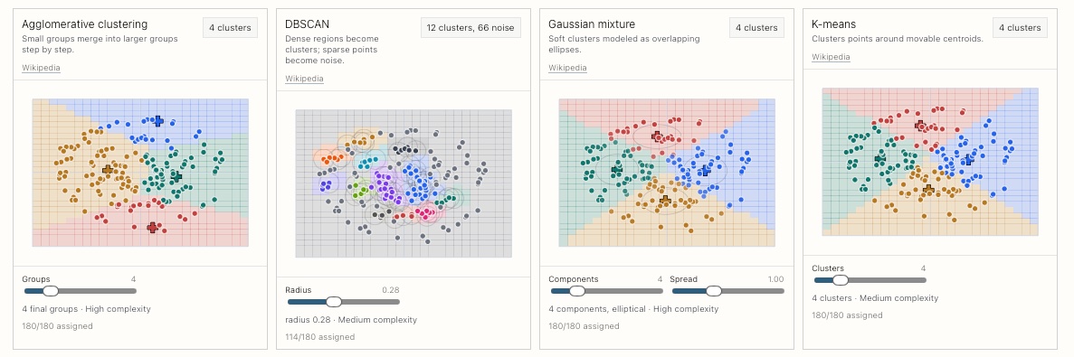
I ended up building a small interactive explainer for seeing how different classification and clustering approaches behave on the same two-dimensional data. I used a handful of dynamically-generated toy datasets. The goal was not to make production-ready classifier, but to make model behavior visible, and allow you to play with the parameters.
The app has two views: a single-model view for showing one method at a time, with model-specific controls and explanatory notes; and a model comparison wall that puts every model in a small-multiple layout, so the same generated dataset can be compared side by side.
All datasets are generated synthetically in the browser. The generator creates familiar teaching shapes such as separated blobs, overlapping blobs, imbalanced classes, interlocking moons, nested rings, twin spirals, cluster islands, bridge/noisy-connector clusters, elongated clusters, outlier-heavy clusters, variable-size clusters, variable-density clusters, etc. There are controls for sample count and noise.
You can see it working here: https://www.danielpradilla.info/classification-visualization/compare.html and check it out in github here: https://github.com/danielpradilla/classification-visualization