
One thing that never ceases to amaze me is how bad in-house enterprise applications look and behave: clashing color combinations, buttons that don’t respond to clicks, messy forms, elements that look like links but aren’t, inconsistent non-standard controls, no user feedback whatsoever, ugly reports, you know the drill. It’s even more incredible how the poor users find the courage and patience to put up with those monstrosities.
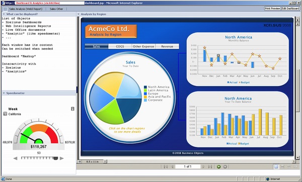
Commercial applications are not exempt from this, although in lesser degrees, because they’re usually tested by real users. Master of all this is SAP, whose interface and user experience appears to have the sole purpose of making us feel miserable at our jobs. Even their Business Intelligence product, whose intention should be to provide a decent way for looking at data, empowers users to create notoriously ugly and unusable charts:
This doesn’t exclude industry darlings like Apple. They also have done their own missteps.
The reason behind all this is that most applications are done solely by engineers. Hey! Don’t get me wrong, I’m an engineer myself. But I also know –somewhat– the limits of my expertise.
With the massive adoption of smartphones and the fierce competition in the different app stores, now we have very well designed applications in the hands of millions. Beauties like Paper, Partly Cloudy, Clear, Instagram or even the mundane mobile Google Maps. Applications who manage the difficult task of being useful and beautiful at the same time.
Also web apps, like twitter, asana, wunderlist, Gmail and even Facebook are becoming more and more versed in good practices of user interface design. So, as an application developer you have more pressure by the users, or at least some kind of responsibility to create pleasant and usable applications.
Nothing beats an engaged user that loves an application which solves a problem for her and it’s a dream to use at the same time. You’ll have better bug reports, better testing and better rapport to top management. If your app doesn’t get someone excited about what it looks like, then you’re doing something wrong.
Ok, I’m a software developer. How do I stop punishing my users?
Use a framework
If you’re developing a web application, user Interface frameworks abound. I particularly like the all-inclusive Dojo and Ext JS. But you can use other standard ones like jQuery UI or yui. Frameworks make your life easier because usually someone who really knows about design has pre-thought things for you. That doesn’t mean that these libraries doesn’t have ux and ui failures (I’m looking at you, Ext JS grid), but still you’re better off using them than boldly deciding to develop your own.
If you’re not keen on using a full blown javascript library for user interface, at least get some help on the static side of things. I –and everyone else– am using twitter bootstrap at the moment.
Hire a designer
In 2005 I started incorporating designers in all of our development projects. We gave them the specs, the intended audience and our general usability idea. They provided the magic. From that moment onwards, people started telling us that our applications where much easier to use, and even beautiful. They went from “Meh” to “Wow! I love this!” in weeks. The change was absolutely amazing.
Don’t try to reinvent the wheel
Get some ideas from the best practices around. Sites like UI-Patterns will give you pointers on how to design login screen, error notifications and even forms. Copy the best practices and then innovate.
If you’re designing a Windows client application, you can take ideas from Quince. And please, oh please, at least take a look at the Windows User Experience Guidelines. No, you don’t know everything. You really need to read this.
If you cant’ afford a professional usability test, do the “mom” test
Put someone in your family to use your application. You’ll see how some incredible questions and suggestions emerge from these “regular users” sessions.
Learn some design sensibility
This is the toughest part. It will be very hard to convince yourself that you don’t have any design skills. But believe me, there are reasons why you ended up as a software developer and not in design school.
The Non-Designer’s Design Book changed my way of approaching design and opened my eyes to the pervasiveness of bad design on the web. An easy to follow book that teaches us engineers the basics about typography, alignment and general good design principles.
Also, I read an entire book on forms and it was a life-changer. If you’re doing some kind of enterprise application it will surely have a lot of forms. Forms that Work will teach you a couple or a dozen things you never knew or thought about designing usable forms.
I also keep a tab on Jakob Nielsen’s usability articles. It’s a great free resource of user experience commentary and the product of years of research on good design principles.